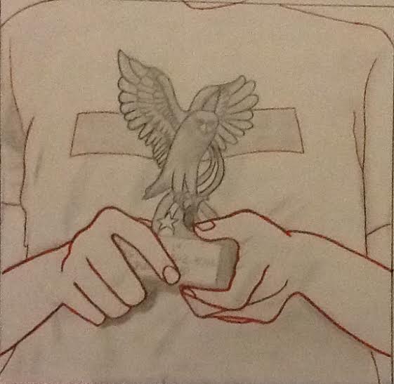
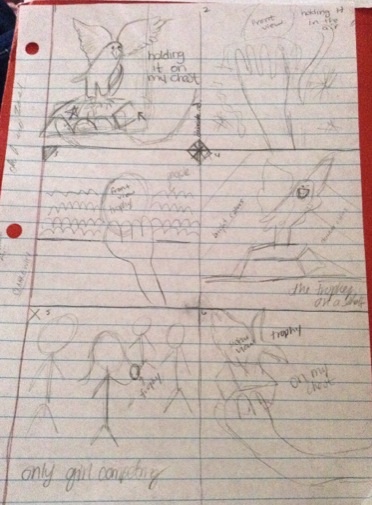
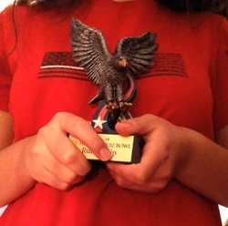
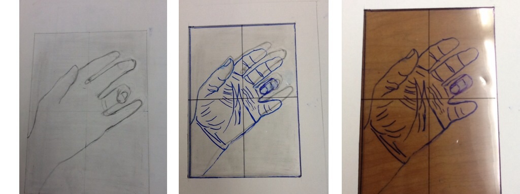
After I received feedback about my drawing, I added color to it. I outlined the most noticeable lines. It wasn't a lot but I thought it was enough to show the message I wanted to have on it. I chose to use red because it's a color that shows excitement, which is what I feel when I see the trophy because it reminds me of how I felt when I was in the competition. What I did was make the lines of the hands thicker to draw attention to them and notice that the trophy is something important to me because I held it with both hands and that it's something I'm proud to have. I think my hands are the most successful part about my drawing.
On the first chair drawing, what I think I did the best on was the top part of the chair. I think this is the best part because it looks very similar to the original picture. The easiest part was drawing the negative spaces on the top of the chair because they're smaller and it's easier to look at them as shapes. The most difficult part was the bottom part of the chair because the shapes were bigger and it was harder to get the angles and sizes of the lines right. I also didn't draw my basic unit on the right place which threw off my drawing. On the second drawing, what I think I did the best on were the angles of the lines on the chair. These were easy to draw because I used my pencil to measure each angle. The most difficult part was getting each of the lines and shapes the size they were supposed to be because I think my measurement shape was off in size compared to the real stool. This skill is going to help me get better at drawing things and thinking that the negative spaces are just as important as the positive spaces. This is going to help get the positive and negative spaces of a drawing look good as a whole.
I started my drawing with the eagle and drew its outline so I knew where it went and where the rest of my drawing would go. What I think is going well on my drawing is mostly everything but my left hand. The angles and the shapes of what I've drawn so far look really good. Right now I'm having difficulty drawing my left hand because the picture I took doesn't look very clear. What I'm going to do to fix this problem is re-take a picture of my hand holding the trophy in the same position so I can see how the lines of my fingers go. Other than the problem with drawing my left hand, there is nothing else that is not working so far. I also haven't made any changes from my original plan so far.
When I chose to draw the trophy, I had to decide where in the paper I was going to put the trophy and what the background was going to look like. These are the options I had in the beginning. I drew different backgrounds and ways that I could be holding the trophy. Out of these I chose the one where I was holding the trophy with one hand in front of my chest to make the trophy important. My original idea was to hold it with one hand but while I was taking the picture I decided that holding it with both hands would show that the trophy is something very important to me. I was also thinking of putting color to it but decided not to because my drawing would have too many details on it that would be hard to color. This is what I will draw for my final drawing and it will be in black and white. I don't know if just having it in black and white is going to successfully show the meaning I want it to have. (It's a risk I'm taking.) The two most important elements and principles of design that I used to create a more powerful composition were movement and size. I used movement by holding the trophy with both of my hands which makes you move throughout the picture and notice that it's in front of my chest. This shows that the trophy is important to me and that I really care about it. The size of the trophy is fairly big which also shows that it's something important to me. These elements and principles of design add meaning to my drawing. I also decided to center the trophy in the picture because I wanted the attention to be on the trophy and on how I was holding it with both hands. What I did first was look at Mrs. Singleton's inspiration board. I didn't get any ideas from it so I just decided to make a list of what I would like to draw. My list had animals, faces, flowers, people, and landscapes. After this, I went home and took of things that had a lot of lines. It seems like my list didn't help me with anything because I ended up just taking pictures of things that would be interesting to draw. These are the pictures I took. For this project, I chose to draw the trophy of the eagle I won in a U.S. History quiz bowl in eighth grade. What inspired me to do my first project on this was that it means something to me and by drawing it I can have a feeling/message on it. Since I just decided to do this for my first project because I felt like it was something good, I didn't get inspiration from any artist. What shows my creativity and imagination is the way I'm going to hold the trophy with both hands. This will show that the trophy has a meaning to me. All of my ideas are connected to my daily life because I see them everyday. Some of them are just simple things that can have a message or something but that I don't think of it. When I got this assignment, I thought of things that had a lot of lines and took pictures of things that I thought would work for this project. I chose the trophy of the eagle because the wings have a lot of lines and the whole eagle itself also does. My goal for this project is to successfully show the message I want my drawing to have. I also want to really get into R-mode so I can make a nice drawing and get a good grade for it.
To practice drawing edges, we did a blind contour drawing, style practice, and a hand drawing. What shows I have improved on drawing contour lines was the blind contour drawing. I was drawing a rolling chair and the bottom part turned out pretty good. Some of the lines on all the chair really looked like the outlining of the chair although some of the lines did not lign up with each other. Another part that shows I have improved was the blind contour drawing of my hand. I could identify some of the lines with the creases of my hand even though the lines overlapped. What I thought was the most difficult part was the hand drawing on paper because it required more observation. It was hard getting the sizes of the fingers right. Another hard thing was figuring out my style of drawing on the style drawing because I just drew random things on the last box. I drew them kind of fast but the speed I draw in would just depend on what I'm drawing. In the end, I kind of thought I was in between the medium slow and medium fast. The easiest part about all 3 drawings was just drawing the blind contour drawing and the first part of the style practice. The blind contour drawing was just drawing what I saw and the first part of the style practice was just drawing how other artists drew lines. This skill is definitely going to be very useful in the future. It's going to help me on observation drawings. Using this skill is going to help me make better drawings and make my drawings look like what they're supposed to look like.
I think my pre-test drawings are okay. I think my best pre-test was the drawing of my hand. I was really focused on drawing what I was looking at although it didn't turn out exactly the same as my hand. My fingers looked a little bit thinner and longer than what they really are. What I thought I did the best was my thumb because the shape, length, and width are pretty much the same in relation to my thumb. On drawing my portrait, what shows I was really looking is my nose and the whole shape of my face. The rest was kind of hard to draw because I was moving a lot. I think I wasn't in R-mode because I just wanted to make it look like me which in the end it didn't. I wasn't looking at it as just shapes and lines and maybe that's why it didn't look like me. When I was doing the vase/face drawing, I was really focused on drawing the whole line. After I drew it, I noticed that most of it didn't look like the original line. I went back and erased the parts that didn't look the same and got it to look better. While I was fixing it, I could feel that I was in the R-mode. The line I drew was slightly above the original line but it still looked very similar. I didn't want to go back and re-draw it because it was just a practice and because it would take more time. The upside-down drawings really helped me get in R-mode. I was really focused on drawing the shapes and lines that I was looking at without thinking about what they really were. When I started drawing the Pablo Picasso portrait, I didn't even think about what I was drawing until the end when I asked myself what the top part was (the legs). What I finished of my drawings look very similar to the original ones although some of the proportions are wrong but I'm still happy with what I did.
|
Archives
December 2014
CategoriesAuthorBriceida Sandoval |