When I chose to draw the trophy, I had to decide where in the paper I was going to put the trophy and what the background was going to look like. These are the options I had in the beginning. I drew different backgrounds and ways that I could be holding the trophy. Out of these I chose the one where I was holding the trophy with one hand in front of my chest to make the trophy important.
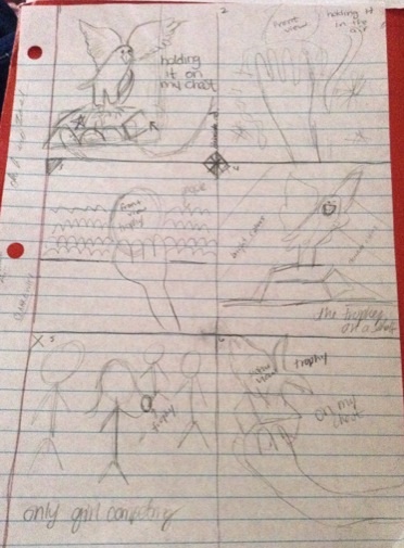
My original idea was to hold it with one hand but while I was taking the picture I decided that holding it with both hands would show that the trophy is something very important to me. I was also thinking of putting color to it but decided not to because my drawing would have too many details on it that would be hard to color. This is what I will draw for my final drawing and it will be in black and white. I don't know if just having it in black and white is going to successfully show the meaning I want it to have. (It's a risk I'm taking.)
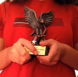
The two most important elements and principles of design that I used to create a more powerful composition were movement and size. I used movement by holding the trophy with both of my hands which makes you move throughout the picture and notice that it's in front of my chest. This shows that the trophy is important to me and that I really care about it. The size of the trophy is fairly big which also shows that it's something important to me. These elements and principles of design add meaning to my drawing. I also decided to center the trophy in the picture because I wanted the attention to be on the trophy and on how I was holding it with both hands.
 RSS Feed
